Graphics designed for Instagram use @savesugarcreekranch. No longer live.


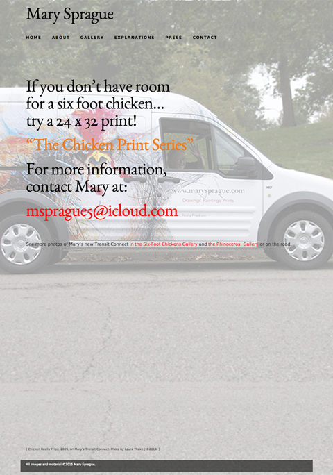
“I didn’t think the old one needed replacing and was worried that you were just doing busy work. Silly me. This is going to be way better. It’s fabulous and I’m loving it.”
: : : Mary Sprague, Artist, St. Louis, MO and Hammond, NY
“Well I finally had time to properly enjoy this beautifully designed website. Sorry I didn’t indulge sooner. This site was clearly created with love. All the invisible and unknowable steps used to bring it to life are hidden and all that is seen is pure delight. Great job, both of you!”
: : : Peggy King, St. Louis, MO

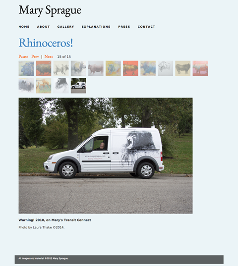
This Warning! (gorilla) side of the Transit was designed by my sister, Laura Thake.
Shown below is the first site for Mary Sprague.

“Kathleen’s work is the result of an extremely articulate well-trained mind under great inner pressure dedicated to terrific results. And she gets them regularly. She was my best student thirty+ years ago and is my best collaborator now. Just take a look at the web site she built for me. Thank God for Kathleen!”
: : : Mary Sprague, Artist, St. Louis, MO and Hammond, NY
“I love, love, love your new site, and have posted it on Facebook for my friends to see. I love the rhinos in 2 and 3 d, and it’s wonderfully funny and well done. I’ve emailed it to other artists who are looking to make or improve their sites as a fine example.”
: : : Laura Foster, Curator, Frederic Remington Art Museum, Ogdensburg, NY

Volunteer project to overhaul existing site and make it responsive. This version of the site is no longer live.
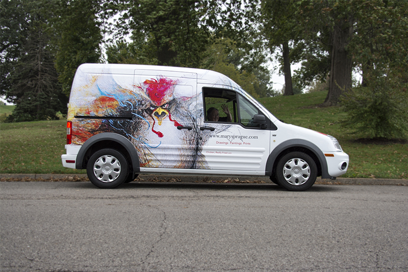
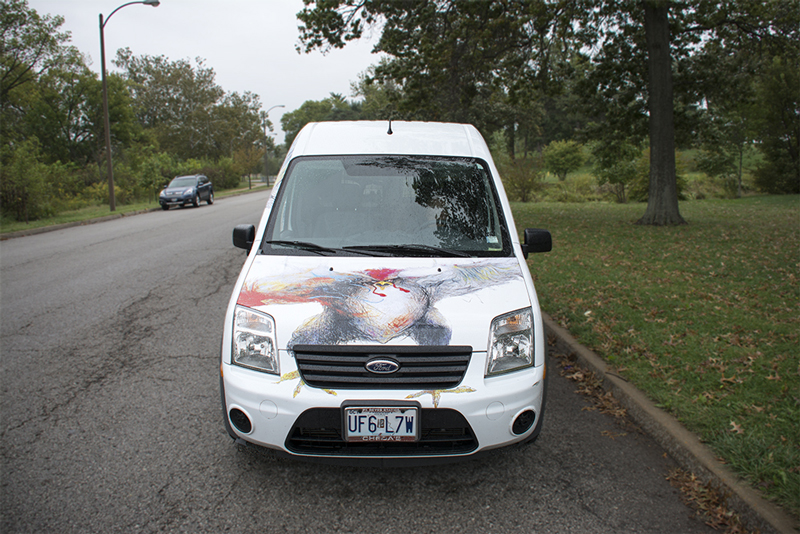
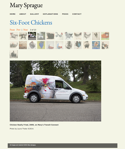
Mary is selling limited edition prints of her sold out “Chicken Series.” Her new truck is the perfect vehicle to generate interest. It features Chicken Really Fried, 2009, as shown above and a huge gorilla on the other side!
Photos by Laura Thake, ©2014.


Spreads from the book, Sign Design Environmental Graphics, showing the signage system for the Kennedy Center designed in collaboration with Peter Van Allen at Creative Signage Systems. Signage system to help visitors find their way from all points of entry to the ticket offices, performance venues and restaurants. There was no universal symbol for selling tickets so I designed one.


Signage and wall graphics for new office space.

Northwestern University parking signage system. All lots on campus were color coded for quickly determining if your permit is valid in a particular lot. Visitors to campus are given a yellow parking pass by University Police and instructed to look for lots with a yellow dot on the sign.

IES Institute for the International Education of Students, Chicago office signage.

Banners for the Mental Health Association of the North Shore to raise awareness for Mental Health month beginning in May, 2005. Businesses and organizations sponsored the banners which were on display in Evanston, Glencoe, Highland Park, Northbrook and Wilmette, Illinois.

Promotional poster for the design firm, Yankee Doodles, in Washington, DC. A single photograph by Earl Zubkoff, no retouching in this pre-Photoshop image.

Fiestaware salt and pepper shakers with purple Italee. Photo by Dennis Staffne.

1978 The first in a series of ten posters announcing a fundraising 10K run for the National Symphony Orchestra. There was a t-shirt designed each year for the runners and volunteers. The posters became very popular and were sold to raise additional funds. I drew the treble clef with pen and ink and French curves then drew the runners based on the Eadweard Muybridge photographic studies of motion. All services donated for ten years. Continue scrolling to view the entire NSO series.

1979 & 1980 In 1980, several runners showed up for the race wearing bow ties around their necks and on their shoes. Fun! Martha Vaughan illustrated the shoe.

1981 The tie was illustrated by Martha Vaughan, I drew the runners with instruments, adding to the original series. These were shot as photostats and placed on an acetate overlay. On press, the runners were set up as a split fountain with silver on the left and gold on the right. This created a beautiful bronze-colored treble clef. No two posters were identical.

1982 Illustrations of instruments were hand-drawn then stats made at various sizes to create repetition and patterns. These were cut out with an x-acto knife and arranged to form a footprint, heavy at the bottom where the foot strikes the ground first and lighter at the top. Printing was a split fountain of dark metallic blue and silver.

1983 From 1983-1987, I teamed up with a great photographer, Earl Zubkoff, who was game for anything. In 1983, I found an old and broken violin at a thrift shop, cleaned it up and spray painted it white (several coats). Then I dyed shoe strings and tied them onto it. The violin was suspended on an arm that went through a 4 x 8 milk white plexi sweep then shot 4 x 5 with no retouching. This poster won many awards including acceptance into the CA Design Annual.

1984 We rented a French horn and took it down to the running path along the Potomac River across from the Kennedy Center. That is me running in the red shirt in front of the Kennedy Center. The Watergate complex is seen on the left side by the tree. The 35mm shot was composed in the camera with no retouching in the reflections or distortions. We shot several rolls of film but there was only one shot with both runners in front of the trees. We recruited people who were running by to be in the shot with the promise and subsequent delivery of a run t-shirt and a poster in lieu of payment.

1985 A Steinway grand piano was borrowed and delivered to Earl’s second floor studio. We meticulously covered the keys with plastic wrap and placed real sod on it. Shot 4 x 5 by Earl Zubkoff.

1986 Black and white art was drawn to mimic the bottom of a running shoe, the drum was open from the back and lit from inside with gel filters. A film positive of the foot was projected onto the drum. Shot 4 x 5 by Earl Zubkoff.

1987 I found an old viola case at a thrift shop and rebuilt the inside. It was lined with purple velvet complete with cut outs for protecting running shoes and a roll of music for viola solo. We placed it on a park bench in the studio and lighted for dramatic effect. Shot 4 x 5 by Earl Zubkoff.

Painting by Mary Sprague for the SLSO celebrating 25 years at Powell Symphony Hall.

Poster for Mount Vernon to commemorate the Bicentennial of George Washington’s Inauguration as First President of the United States. The poster was sold in the gift shop.

Penny Candy Poster was used as a marketing piece for a design firm and a printer. The candy was shot on yellow seamless. We set up an accurate red string grid, placed the candy and then removed the string and shot it 4 x 5. The penny was photographed separately in 2 1/4 and stripped together by the printer in the film. The final printed red grid was hand-inked on a piece of frosted vellum with a black and white photo stat of the candy underneath it as a guide for where to stop and start the lines. Tedious work in the pre-computer era! The candy is actual size on the final printed poster.
Could not find the licorice records that would unroll with a red candy in the center. They are a fond memory from Morganelli’s at the corner of 80th & Damen in Chicago in the early 60s. We agonized over how to spend a dime on their penny candy when visiting our cousins. Walking across Damen Avenue only added to the adventure! Photo by Earl Zubkoff.

Boo Poster was a Halloween self-promotional mailing for a design firm and a printer. The entire back side was printed in a deep day-glow orange. The staff collaborated to decorate the jack-o’-lantern and it was shot 4 x 5 by Earl Zubkoff.

IES Institute for the International Education of Students. Comprehensive catalog for use by study abroad coordinators to help college students determine program options.

Individual catalogs from specific countries such as Spain, Italy, France, Ireland and England are freely given to students. Catalogs include program features, course listings, calendars, directors and staff info, student testimonials and more.

Promotional brochure provides an overview of all IES programs to help students focus on an area of study or a particular city or country. Photos and messages from other students add valuable peer insight.

Brochure introducing the IES MAP, an educational tool for designing and evaluating study abroad programs.